Uinta-Wasatch-Cache National Forest Site Redesign
By Devon Skidmore
Background
Design Challenge
I enjoy spending time outside and always like to plan ahead and see what is available in the areas I visit. One thing I have noticed is the poor quality of government websites for less popular parks and areas. This was a design challenge I completed on my own for the website of a local National Forest.
Tools Used
- Sketch
- Figma
- Adobe Illustrator
Additional Info
Since I completed the design challenge, they've updated their site. I was happy to see some similarities between my designs and their updates. Below are links to the current site and an archived version of the site that I referenced while working on this.


Initial Reaction & Analysis
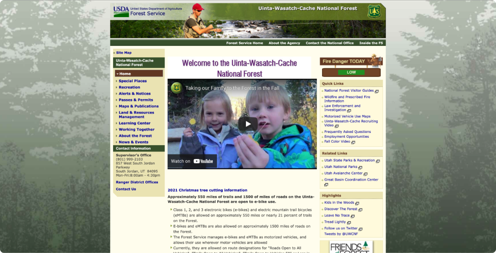
- There's no clear hierarchy to the information on the page. Scrolling down the page had information that would need to be filtered or sorted so it's easier to navigate.
- There is too much on the screen. It’s cluttered and confusing. It’s hard to know where my attention is supposed to go. The
information in the side menu, related links, quick, links, and highlights sections provide too many options to process at once. - “2021 Christmas tree cutting information” seems like a section header instead of a link. It also seems like important seasonal
information not given proper treatment. - The top/primary menu doesn’t help navigate the site, it links people away from the UWCNF page. It seems like it should be a
menu for the parent USFS site but the two sites don’t match. - The image with the fisherman at the top draws unnecessary attention to a section of the site that provides minimal value or
information. - The video takes up important space but doesn’t provide much value or information.
- The background image is low quality, distracting, and adds to the confusion
- There information hierarchy is confusing. There are not clear priorities or calls to action.
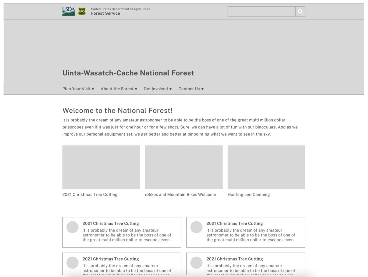
Wireframes
The first thing I did was improve the information architechture. I tried to identify what I thought were the most important elements. I based that on the reasons I assumed people would visit the site: finding information about activities, getting involved, or to learn about the forest.
I also tried to condense the menus as much as possible and put them at the top in categories I felt made sense.
Designs
Inspiration
I wanted the site to feel like a government site so I found other sites that were better and drew inspiration from them. These were the three main sites I referenced.
- The US Forest Service homepage (fs.usda.gov)
- The National Parks homepage (nps.gov)
- The US Web Design System - USWDS (designsystem.digital.gov)
Font
The U.S. Web Design System (USWDS) provides free access to Public Sans. It’s simple, easy to read, looks clean, and has continuity with other government sites so I used it.
Colors
I looked at different color options from nature, the USDA logo, and USFS logo and ultimately decided on the colors below. They convey trust, calmness, and represent the outdoors.

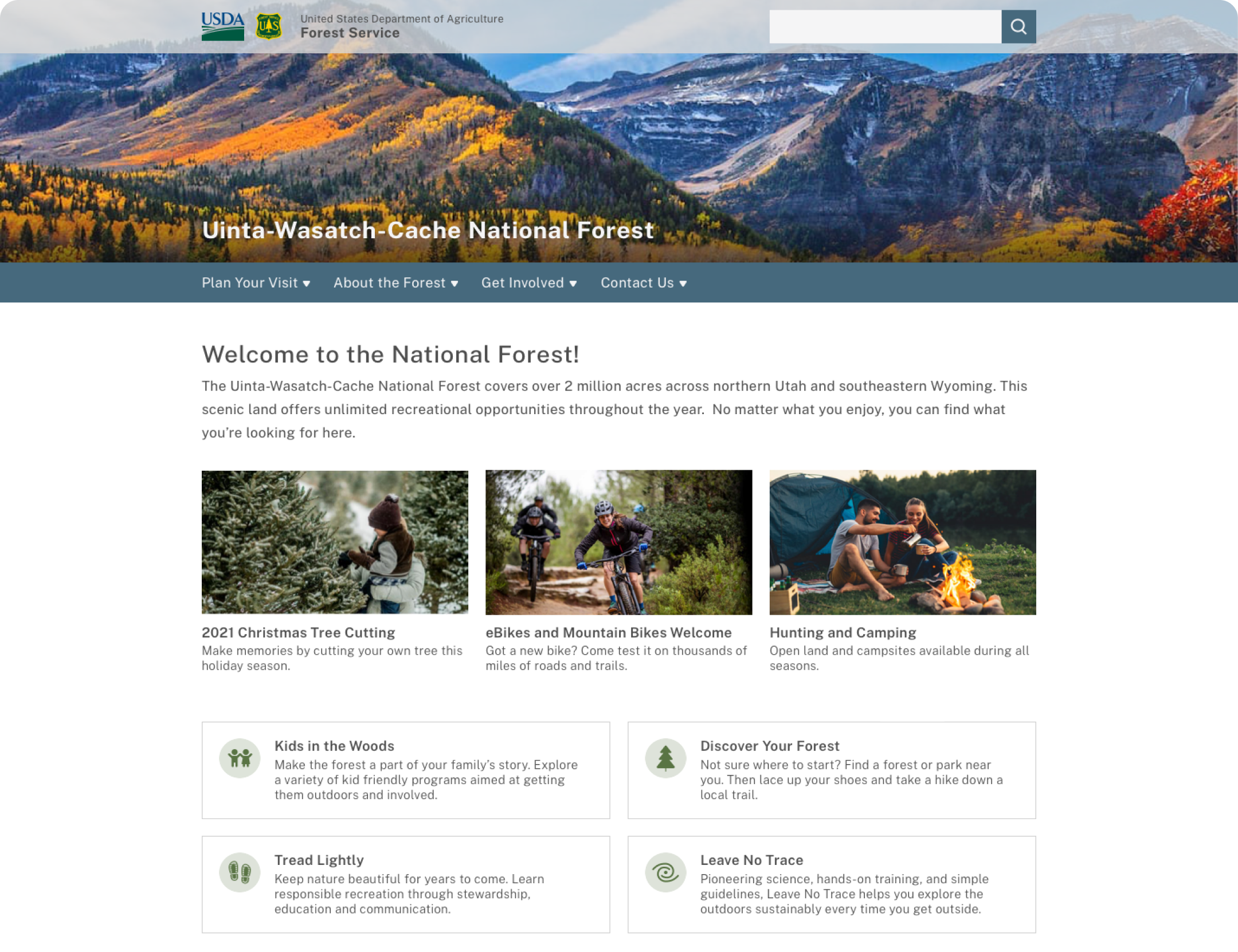
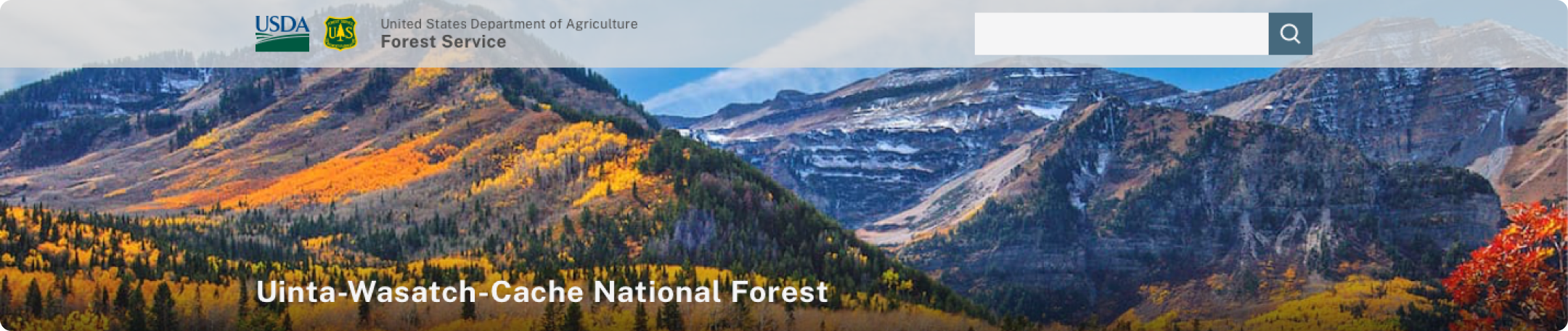
Site Image
The semi-transparent bar allows the main image to be larger and still show the logos, titles, and search bar.
Main Navigation Bar
Hover provides a drop down with menu options from the former side menu, quick links, and related links. A card sort would help to identify where items from those sections would go and how to title menu options. I named them based on what I felt are the main reasons for visiting the site.

Primary Information
Updates, alerts, and announcements can be posted here for seasonal activities. The images draw attention and communicate something about the page it leads to. The title and blurb give additional context.

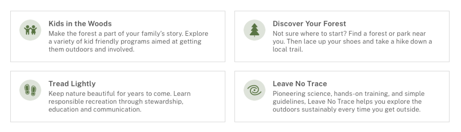
Secondary information
Other programs and activities the USFS wants to promote on a longer term basis. Title and blurb give context and spark interest. Icons help draw attention and match the page content. I created the icons.
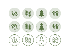
Icons
I went through a few iterations on the icons. The dashed line were to represent the ticks on a compas, trail on a map, and/or
stitching on a patch. Ultimately I felt it was too crowded and removed the dashed lines
Final Design