Sling Home Redesign
By Devon Skidmore
Background
Product: Sling
Sling is a television streaming service. It is available as a mobile app, in web browsers, and on televisions or streaming devices.
This is a conceptual exploration. I wanted to explore changes to our Design System.
Content on the homepage is ordered to help people find something they want to watch. The top is more granular and specific to the individual profile. Moving down, things become more broad and general.
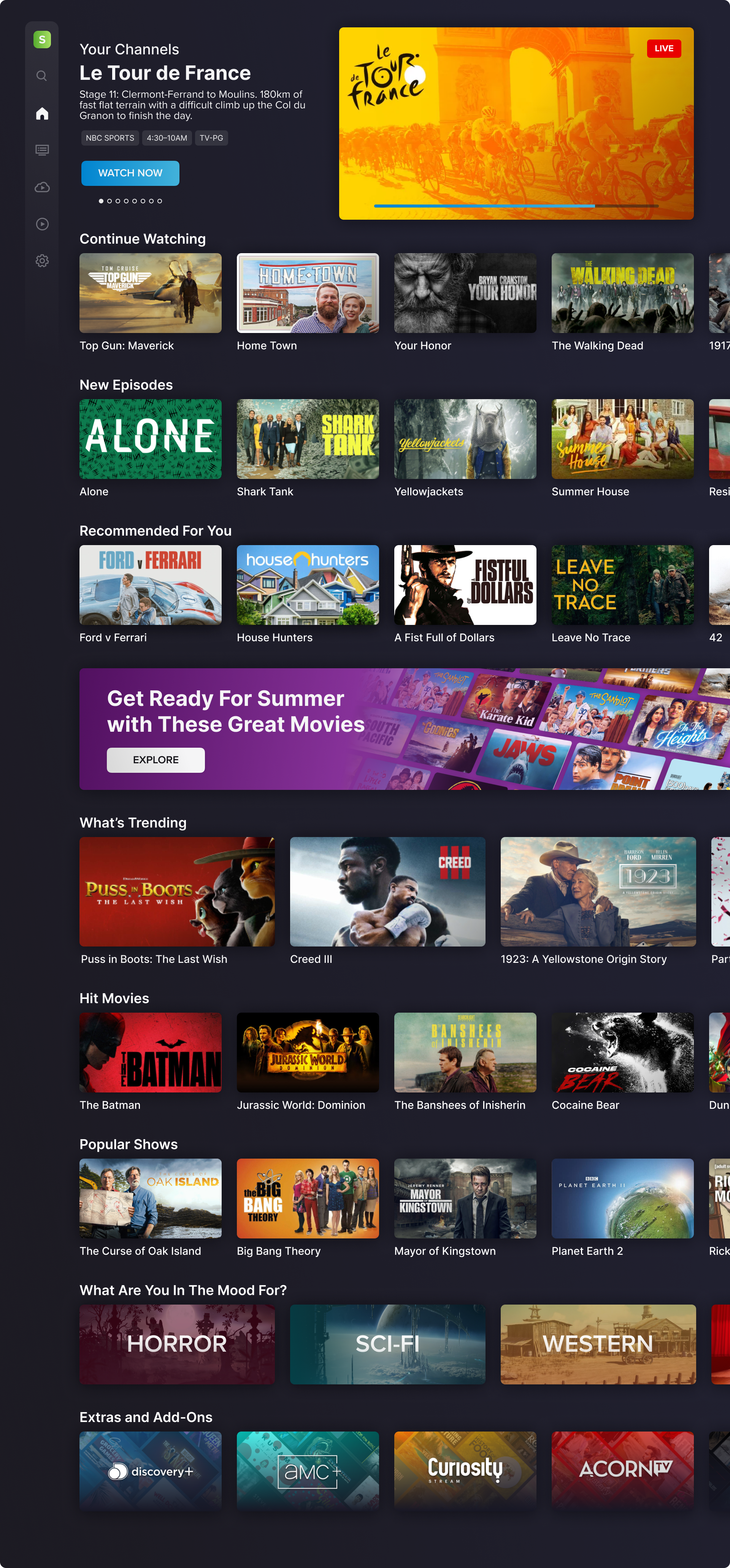
Your Channels
The top section highlights what is currently airing on the person’s most viewed/favorited channels.
Sling is mostly used for viewing live TV. This allows people to more easily find and access the channels that they watch most.
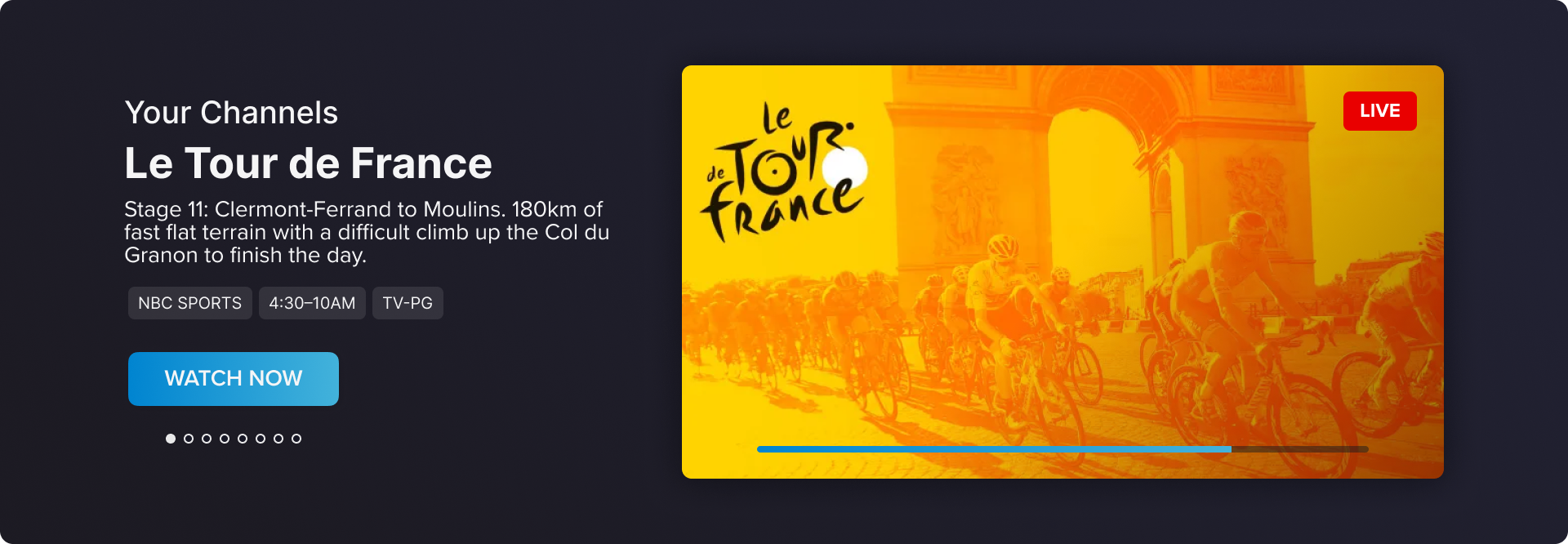
Personalized Section
Quick access to shows and movies we know people want to watch.
- Continue Watching has assets they’ve started but not yet finished
- New Episodes has the newest episodes from shows in the person’s DVR and Watchlist
- Recommended For You has suggestions based on what the person has watched and added to their Library.
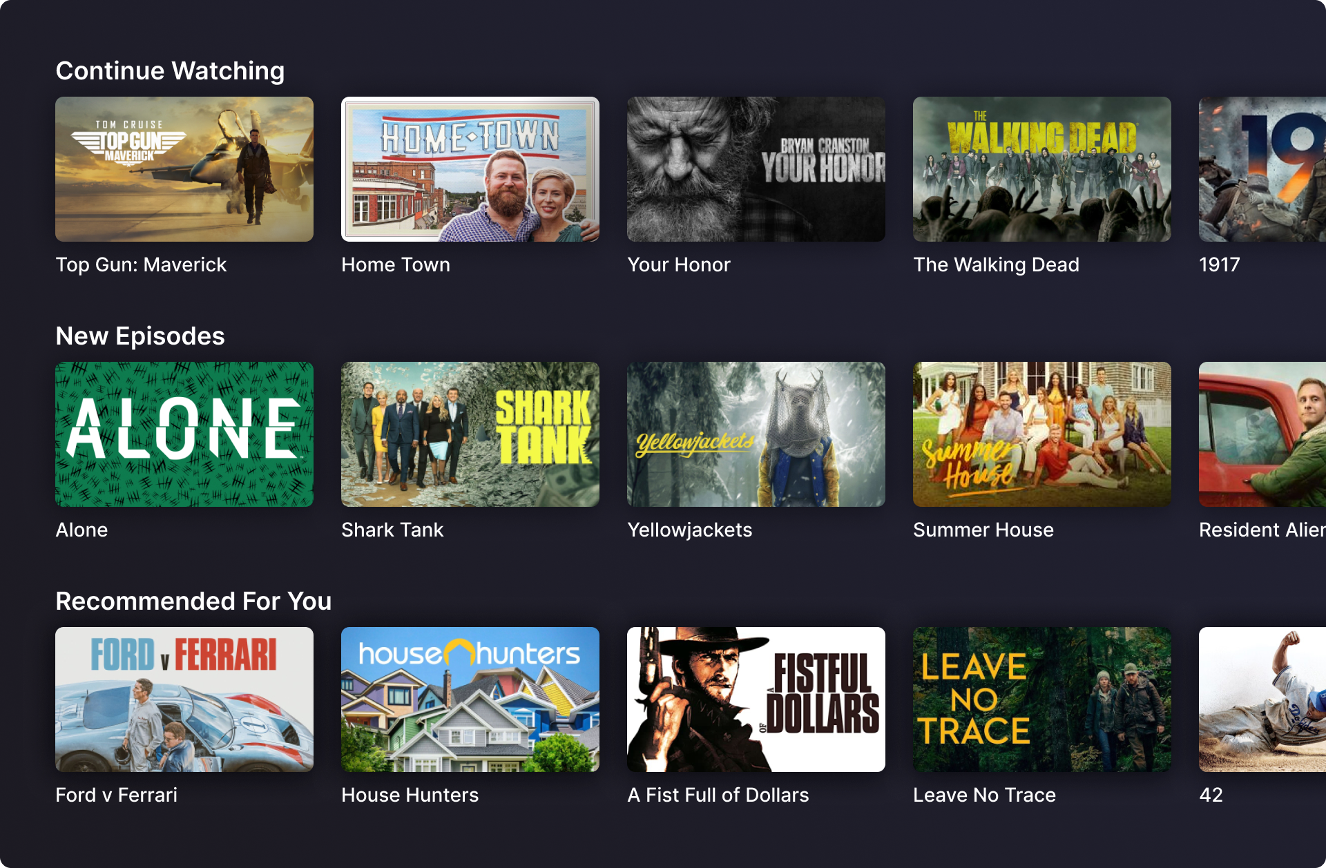
Promotional Banner
The banner is used to promote seasonal and event specific content, i.e. Christmas movies, horror movies near halloween, summer movies, Olympics, World Cup, etc.
The banner can also be used to promote business objectives and upsell opportunities.
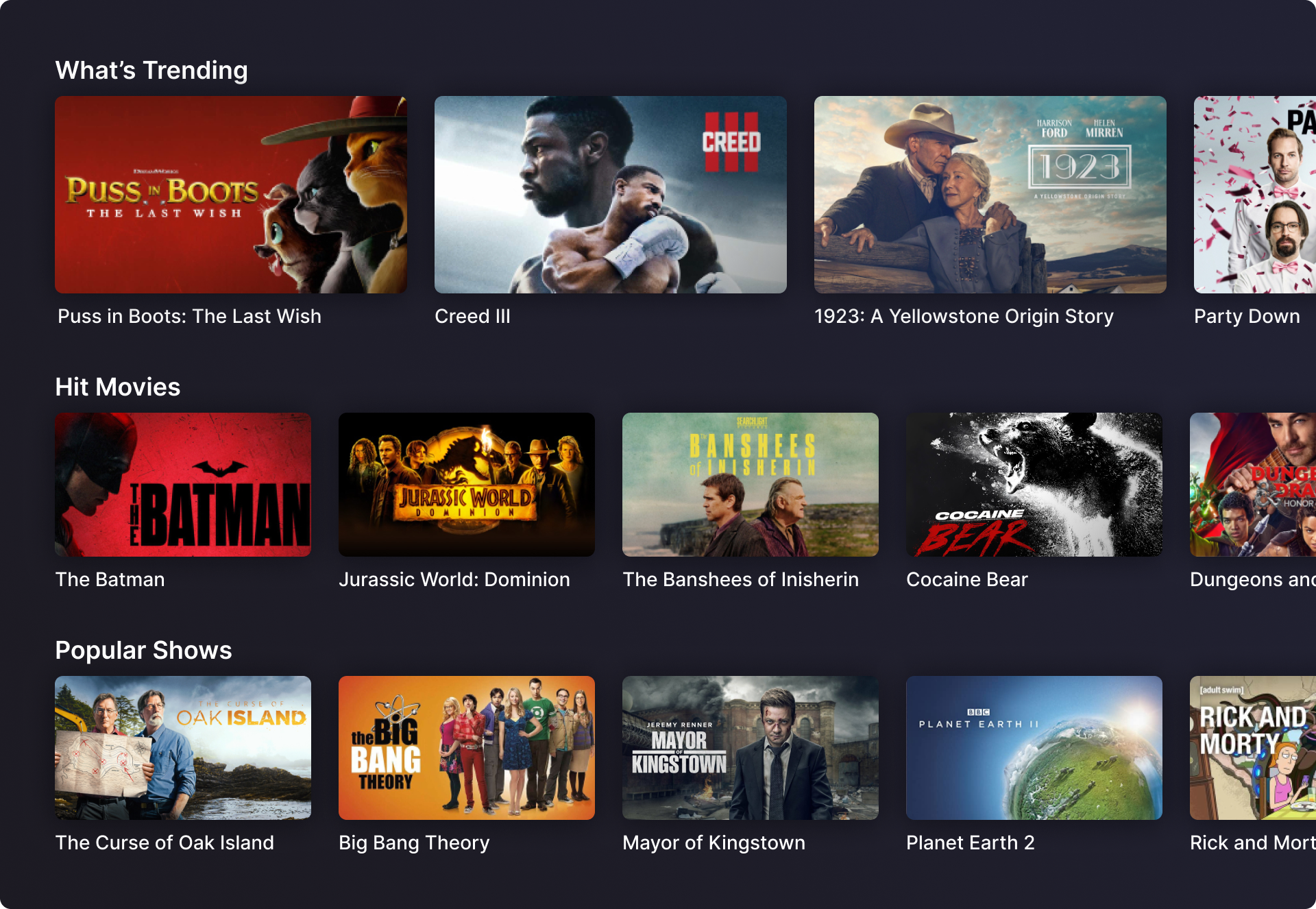
Popular Items
If someone gets this far down on the home page without having moved to the guide or search, they are most likely browsing for something to watch.
- What’s Trending shows what other people are watching right now.
- Hit Movies has highly rated movies released within the recent past.
- Popular Shows” has a mix of older and newer shows with high viewership.

View More
Ribbons with recommendations have 8 tiles. Limiting the number of options in a ribbon would hopefully reduce choice paralysis and make it easier for people to choose something to watch.
Ideally we recommend something that the person wants to watch early on. However, recommendation algorithms can't account for how a person's mood or factors outside what they've done in the app. To account for that, there's a View More tile at the end of recommendation ribbons. The tile takes the person to a Browsing Page which I explain after the next section.
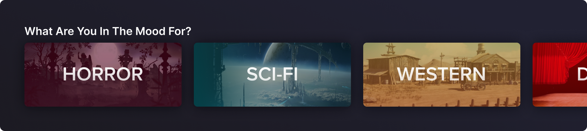
Mood/Genre Based Exploration
In Sling, anything further down than 6 ribbons doesn't get used much. They've eitehr found something to watch, abandoned their search, or moved to a different section of the app to look. My hypothesis is that they are looking for something to fit their mood but aren't sure what it is. That comes from talking to actual customers, from my own experience trying to find something to watch, and seeing my friends and family try to find something.
The genre tiles allow people to explore things that match their mood. It has a variety of genres and sub-genres they can select and be taken to the Browsing Page.
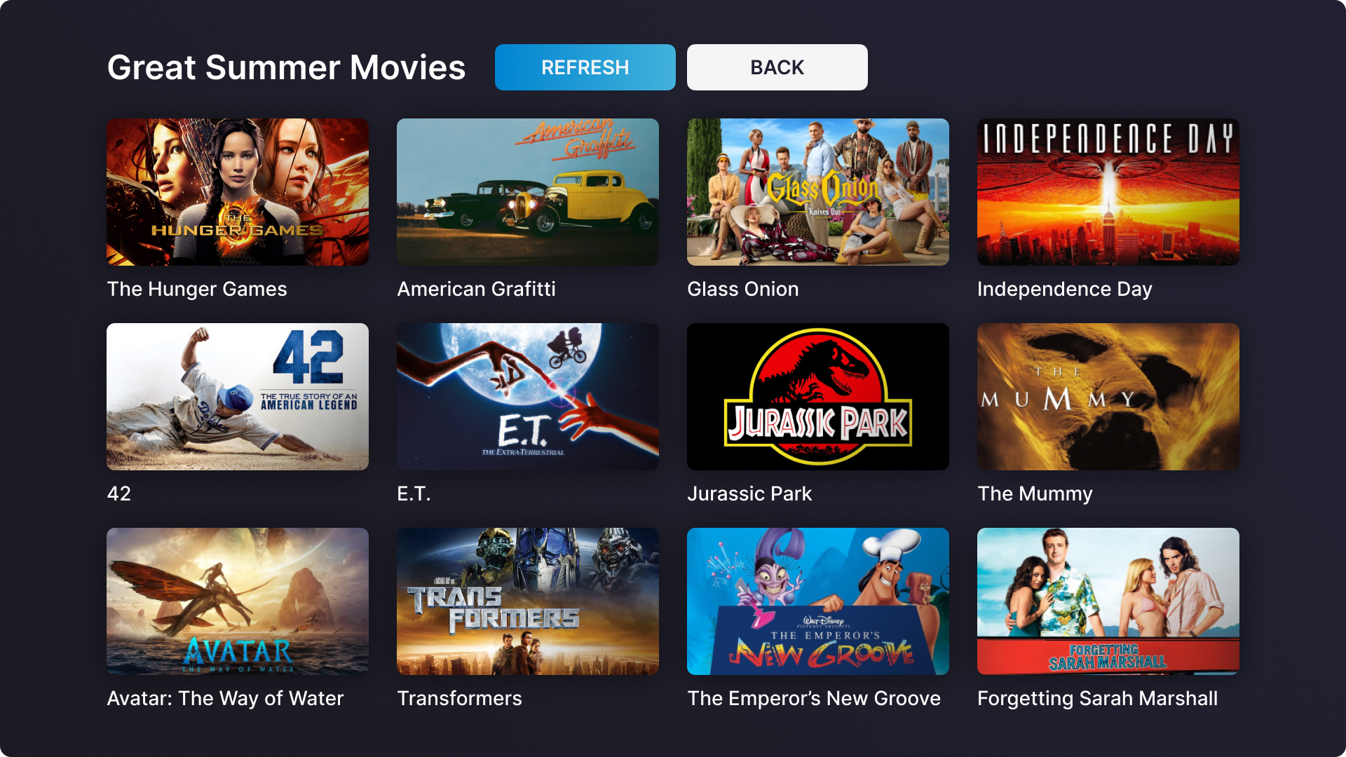
Browsing Page
This page is something I wanted to look into more but never had the chance because I had other projects and priorities to work on. It's objective is to help people struggling to find something to watch.
I've read articles that say choice paralysis is why people struggle to find something to watch and I am not quite sure I agree. Someone could use techniques to limit their options and reduce choice paralysis, but I believe finding something to watch is more of an emotional process than a rational one.
Someone who has had a long stressful day just wants a movie to help them feel good. Maybe they're feeling emotionally constipated and want something to make them cry. There may not be one right thing to watch, but there are a lot of wrong things. Just choosing something could land you feeling unsatisfied and that you've wasted your time.
I think people struggle finding something because it seems like they have a lot more at their fingertips than they actually do.
Most streaming services you look at, as of me writing this in 2023, have a large number of ribbons on their different browsing pages. And those ribbons generally have a lot of the same things in them. I can browse through 5 different ribbons with 10 titles in each one and only have seen 25 unique titles.
Search will help you find something specific but if you're not sure what you're looking for, and you don't want one of the limited items from the unlimited ribbons, you have to do some digging on your own. The Browsing Page helps eliminate that digging. It's about volume and variety.
The title at the top shows what genre, mood, or category is displayed. The refresh button changins all the items on the screen. Some are popular items, some are classics, some are highly rated but not wathced very often, and some are within the category but selected at random.
The screen is easily scanable and allows people to view a high volume and high variety of items without having to change ribbons, screens, or platforms. Hopefully, increasing the odds of finding something they feel like watching.
Full Home Page
The image below has all the different elements put together on the home page.