
Sling Search Redesign
By Devon Skidmore
Background
Company: Sling
Sling is a television streaming service. It is available as a mobile app, in web browsers, and on televisions or streaming devices.
Team: Content Discovery
Our team covers the search function and content discoverability in Sling.
- Product Manager
- Tech Lead & additional developers
- UX Designer (me)
Tools Used
- Sketch
- InVision
- UserInterviews
Additional Info
As a whole the quality of the Sling TV interface did not match the quality of the service provided. People described the app as outdated and clunky. Some aspects needed major improvements to their structure and user flows. As a result Product leadership decided to redesign the entire app across all platforms (mobile, browser, and 10ft.)
Defining the User Problem
Context
From previous user research we knew that people use search for two main reasons:
- Known Search: they know exactly what they are looking for and enter the title i.e. Parks and Recreation
- Exploratory search: they aren't sure what they want to watch and enter a general search term i.e. horror movies
We also knew the breakdown of how people access what they watch from search.
- 40% of video starts came from Recent Serches
- 30% came from Keyboard entries
- 30% came from Popular Searches (the area where search queries populate is pre-filled with assets that other people have been searching for).
Research
We wanted to understand more about people's attitudes and behaviors so we organized a survey and conducted user interviews.
The survey went out to 1000 Sling customers and 626 people responded. We asked a variety of questions around Search in Sling and in other streaming apps. Here are a few examples:
- Which streaming service do you feel has the best search experience? Why?
- What kinds of content to you use search to find?
- What are some things you feel search is lacking?
We conducted 6 interviews and asked the participants to perform various tasks within Search.
Key Takeaways
- The main frustration with search is how long it takes to enter the search term.
- TVOS users preferred a horizontal keyboard, other people preferred a grid keyboard. The difference was because of how the remote works. You can swipe on the TVOS remote but without the swipe option horizontal keyboards take a lot more clicks to enter text.
- Predictive text was important to people because it cut down on the number of letters they had to enter themselves.
- People like seeing what they searched for even if it was in a different subscription.
- Most people like the concept of “Popular Searches” but wish it were more useful for them.
- If something isn’t available people want to see similar items instead of a blank screen.
Competitive Analysis
I also wanted to see what other streaming services were doing so I looked at 10 major streaming services on 5 different platforms. Here are the main things I took away from it.
- 7/10 services have predictive text.
- Predictive text is sequential/alphabetical but search results are not.
- 2 main layouts for the results: grid and list
- 2 main layouts for the keyboard: grid and horizontal

"As a Sling user, I want a quick easy way to find something to watch."
Designs
Flow & Structure
We decided to validate what we learned from the survey and user interviews so I built 3 prototypes, each having a different mix of the keyboard and result layouts.
1. Grid keyboard with grid results
2. Grid keboard with list results
3. Horizontal keyboard with grid results.
We recruited 11 people and I had them complete a search query on all 3 of the layouts. I rotated the order to avoid bias.
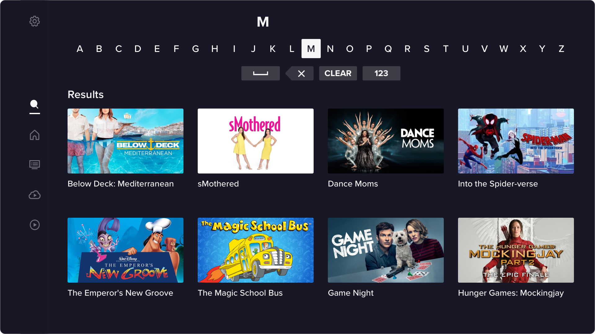
Results matched what we found in our previous research, the grid keyboard is easier to use and quicker to enter text. We also confirmed that images are easier than a text list to scan quickly.
Based on our research and testing, I iterated on the visuals and ended with the following elements and designs.
Recent Search and Search For
These elements take up the same space on the screen, below the keyboard, in the lower left corner.
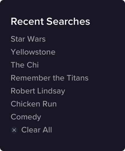
Recent Searches incorporates the search terms the person has used most recently. We settled on 7 terms because there is a sharp decline in usage after 5 terms.
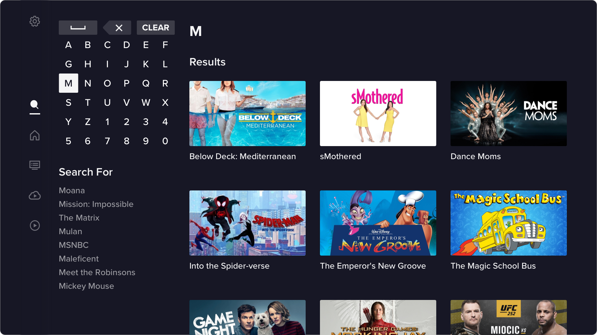
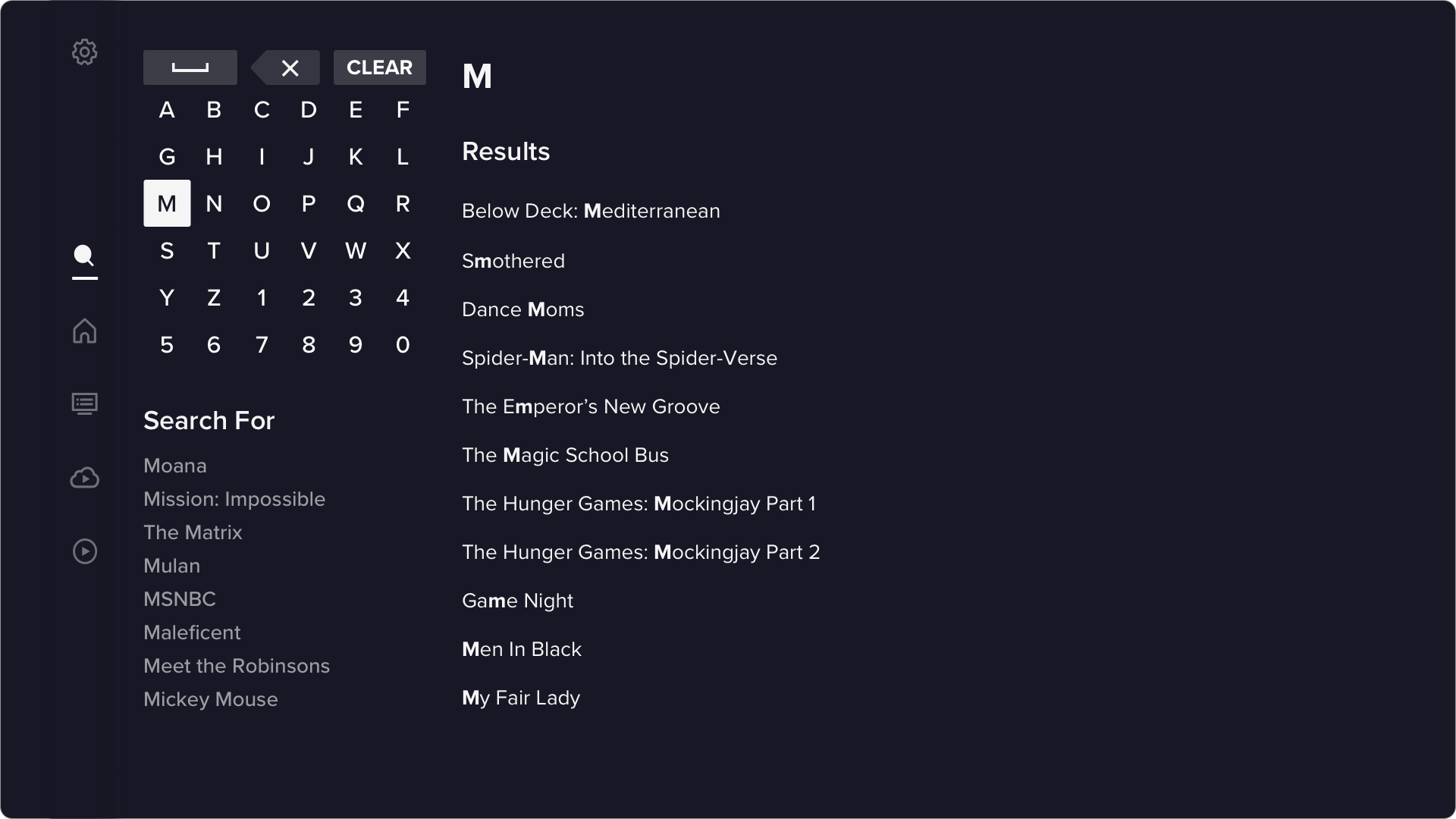
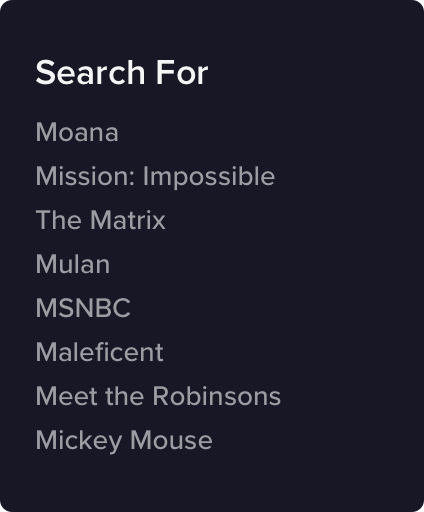
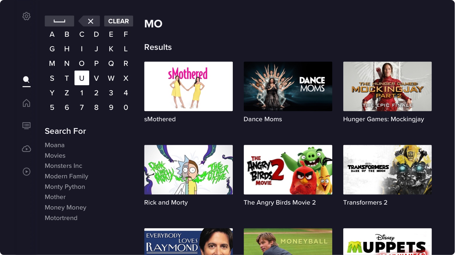
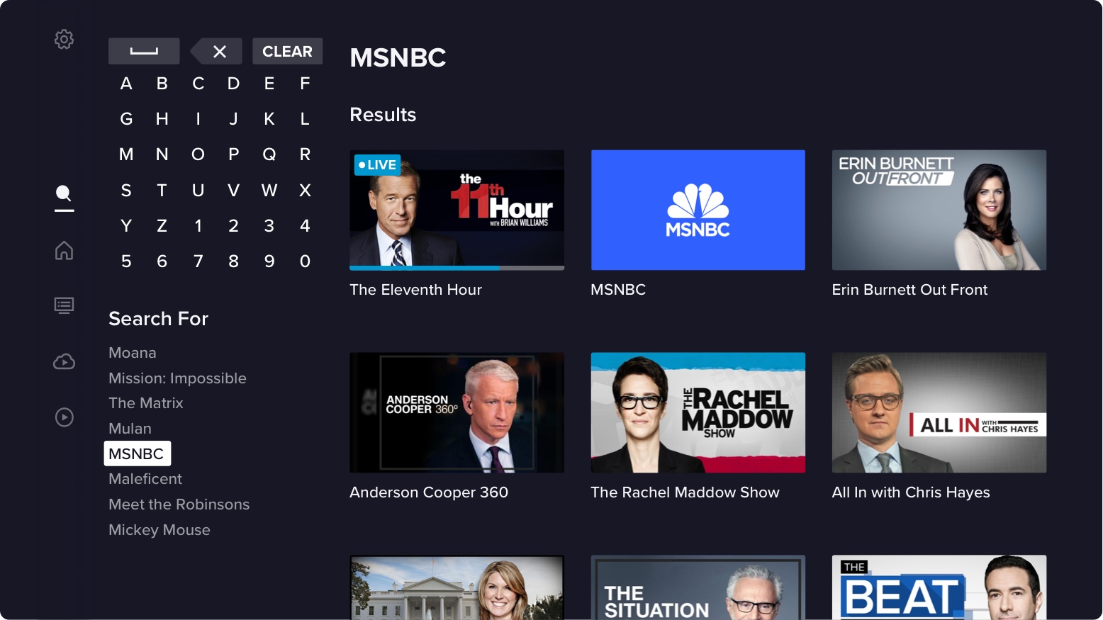
Search For is predictive text base on what the person is typing. It replaces Recent Searches becaust once they have started typing something, they've already decided not to use recent search. For now this section only has assets available in the person's current subscription, but we are working including unentitled and out-of-catalogue assets as well.
Keyboard
Like I mentioned, we used the Grid Keyboard on all platforms except TVOS. To reduce the number of clicks to other letters, to Recent Searches, or to Recommended Searches the letter "O" will be the default focus state.
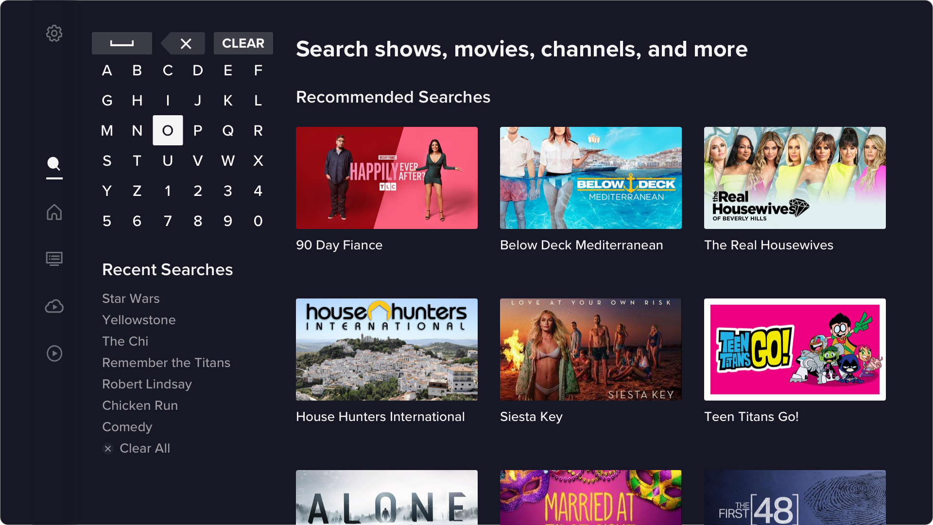
Recommended Searches
Recommended Searches will populate the same area as search results, before the person has entered a query. It will be a mix of the most popular searches across all users and recommendations based on the person's watch history. We're doing live testing to mix and match how that works best.
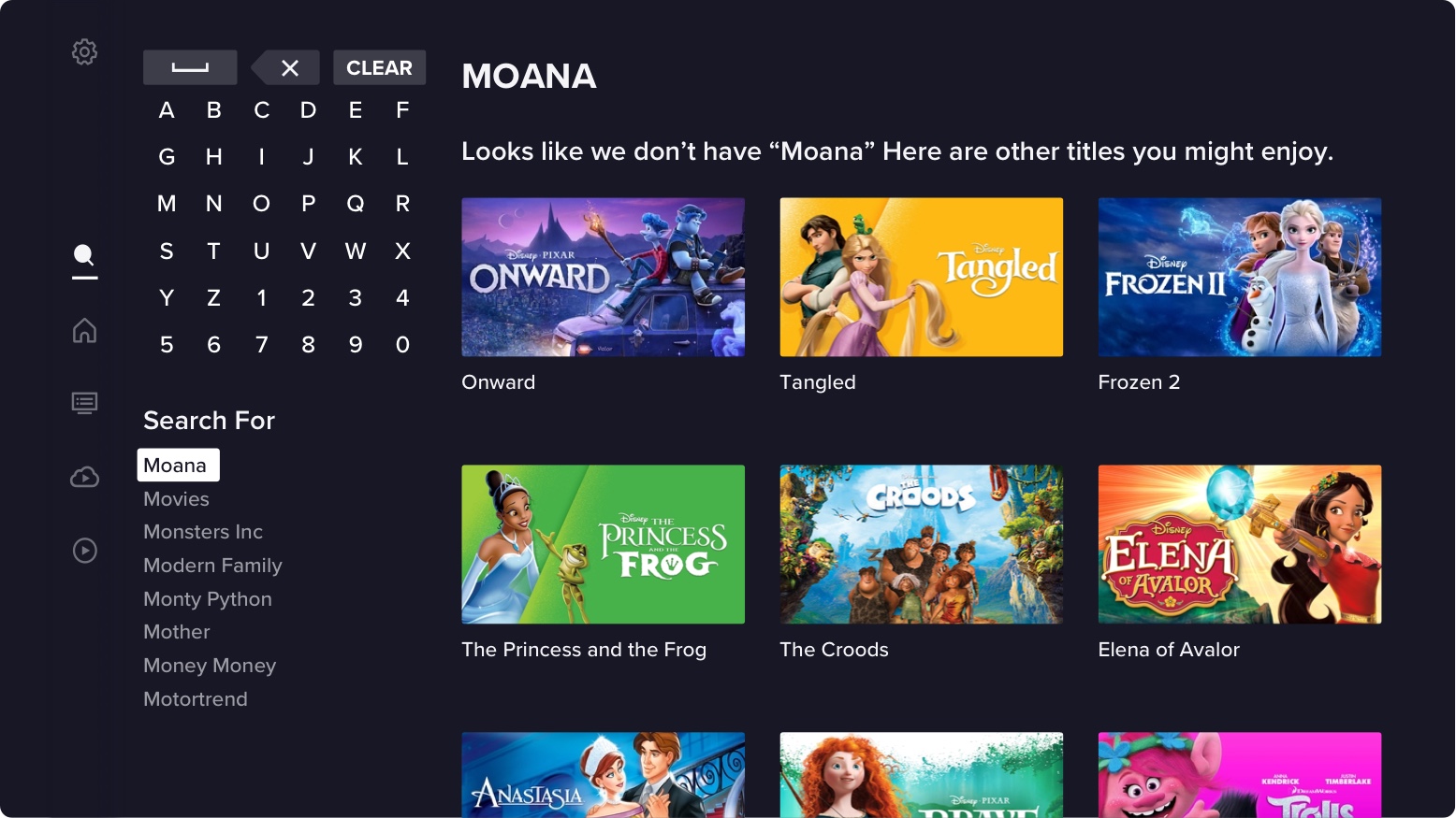
Null Search
When someone enters a search term that has no matches, or uses a term from the Search For list that is out of catalogue we will display other recommendations. If they use a prepopulated term, we will suggest similar assets, if it is a keyboard entry we'll recommend based on the letters they've entered or show the original Recommended Search assets.
Conclusion
I really enjoyed working on this project. My favorite thing about it was starting with a clean slate. We got to reimaginge the search experience and make it what we felt people would want and use. The overall structure didn't change much but it was nice to validate everything we did and had done.
It was also exciting to go through the entire process of researching, designing, validating, and iterating with my entire team. Having a PM, Devs, and Data Specialist all dedicated to this sole project was great. We all felt invested in it and contributed to something we were proud to have worked on.