Guardian
By Devon Skidmore
Background
Company: Sling
Sling is a television streaming service. It is available as a mobile app, in web browsers, and on televisions or streaming devices.
Guardian is an internal onboarding for new media partners. Its purpose is to help them configure API's to integrate their assets and metadata into Sling's system.
My Role
UX Designer
Tools Used
- Adobe Illustrator
- Figma
- Sketch
Additional Info
This project was deprioritized due to a staffing shortage and was unfinished. Most screens never made it further than mid-fidelity. The only things that were fully finished are the landing screen and the logo.
Defining the User Problem
Background
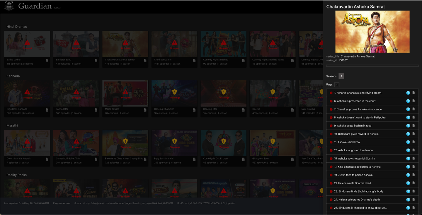
Sling has a large number of media partners and that number keeps growing. The process of integrating shows, movies, and channnels from each partner can take 2-4 months depending on how much content there is. One of the biggest complaints is that the 3 major parts of the process are in separate programs.
- Details and instructions are in a Google Doc
- API building and validation is done in a 3rd party software (something like Postman), it varied by partner
- Guardian is a staging environment after the API works. They can work our the visuals and make sure they correct metadata.
The User Problem
Some preliminary work had already been done before I was brought onto the project. The PM had talked to devs on our side and a number of our parnterns and they were looking for one place where they could track and do everything in the onboarding process.
Additionally the existing Guardian UI was outdated and no longer matched the current UI in Sling. My job was to update the UI and pull all three aspects together into one place.

"We need one easy convenient place to get everything done."
Designs
Logo
One thing I did was update the logo and title so they would fit in the new UI and feel like they fit more with Sling and Dish (its parent company) branding. I wanted the logo to represent the name of the program and was thinking of making a shield or a castle or something similar. As my ideas progressed I tried turning the "G" in Guardian into a shield and liked how it looked. I shared the idea with our team and go positive feedback. I continued to iterate and landed on a shield with a crown on top that looks like a castle's parapet.
Sling had recently removed the orange color (FFA300) from it's logo but it still matched the color scheme in the app so I decided to use it in the Guardian logo.
From top left: the old logo, the new logo for dark environments, the new logo for light environments, the Sling logo, and the Dish logo.


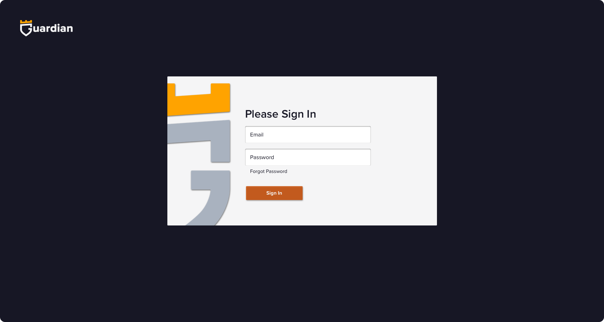
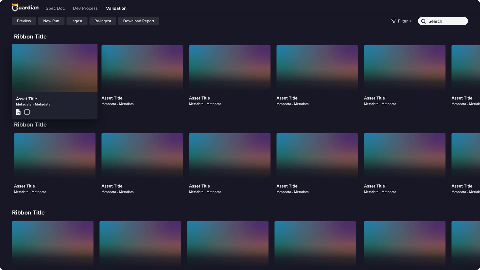
Landing Screen
Internal employees access the app through the okta but external partners would need a landing screen to log in. I kept it clean and simple.
Updated Designs
The first image is the old design and the second is the mid-fidelity new design.
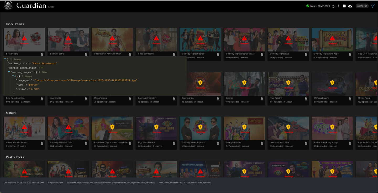
Home

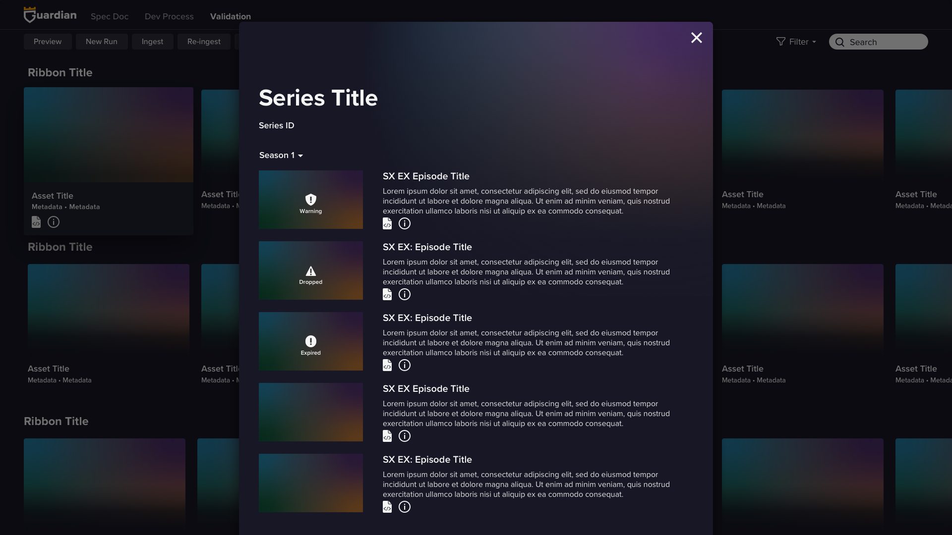
Code Inspector

iView